Your website can be clean. Modern. Mobile-friendly. It can have nice colours, smooth sections, professional photos, and all the right words like “trusted”, “reliable”, and “experienced”.
And still lose leads every single day.
That is the uncomfortable part most business owners do not see. Because when you look at your own website, you judge it like an owner. You ask, “Does this look professional?” But your buyer is asking a completely different question. They are asking, “Can I trust this business with my problem right now?”
And if your website does not answer that question fast enough, they do not complain. They do not send feedback. They do not tell you your headline was vague, your proof was buried, your CTA felt weak, or your form asked for too much too soon. They just leave. They open the next tab. They call the next electrician, the next plumber, the next clinic, the next service provider who feels clearer and safer in the moment.
Here is the real problem. A good-looking website can create a positive first impression, but impressions do not pay invoices. Leads happen when a visitor feels three things at the same time: clarity, trust, and a low-friction next step. If one of those is missing, the page leaks. Sometimes slowly. Sometimes brutally.
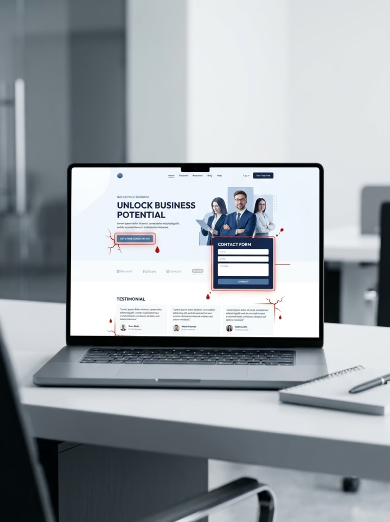
This is what a hidden lead leak can look like: a polished homepage with weak points around the CTA, contact form, and testimonials. If your website looks good but still struggles to generate enquiries, start your project with PixelDreams.
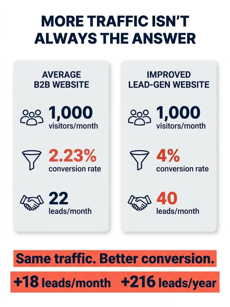
The average B2B website often converts only a small percentage of visitors into leads. Several benchmark studies place typical B2B website visitor-to-lead conversion somewhere around the low single digits. BookYourData cites an average website conversion rate of 2.23%, while Zeliq places most B2B visitor-to-lead conversion rates around 0.8–2.5%, with stronger performers reaching 3–5% when UX, offer strength, and follow-up are improved.
Numriq’s B2B benchmark analysis similarly describes average B2B conversion rates around 2–3%, with top performers reaching 5–12% through systematic funnel optimization. Dedicated landing pages can perform higher: Unbounce’s Q4 2024 benchmark report analysed 41,000 landing pages, 464 million visitors, and 57 million conversions, reporting a 6.6% median conversion rate across its dataset.
That means the problem may not be that nobody is visiting your site. The problem may be that your current traffic is walking through a page that looks fine on the surface but fails the buyer’s risk scan underneath.
Here is the practical revenue math. If a website gets 1,000 visitors a month and converts at 2.23%, that is about 22 leads per month. If the same traffic converts at 4%, that becomes 40 leads per month — an extra 18 leads per month, or 216 extra leads per year, without increasing traffic.
A note on benchmarks: Conversion rates vary by industry, traffic source, offer type, urgency, brand trust, and website maturity. The figures above are directional benchmarks from published marketing and form-conversion studies, not guaranteed outcomes. Use them as a diagnostic reference point, not as a promise of results.
We are going to break the myth that “professional design” automatically creates enquiries. We are going to look at the hidden trust flow that actually turns strangers into leads. And by the end, you will have a simple seven-point Lead Leak Audit you can use to inspect your own website before spending another dollar on ads, SEO, or another redesign.
Because more traffic does not fix a leaking website. It only sends more people through the leak.
TL;DR — Key Takeaways
- A professional-looking website can still lose leads if it does not quickly create clarity, trust, and a low-friction next step for the buyer.
- Most lead leaks happen at hidden decision points: vague above-the-fold messaging, weak CTAs, misplaced trust signals, long forms, and unclear follow-up.
- Before spending more on ads, SEO, or a redesign, run a simple Lead Leak Audit to find where visitors hesitate, drop off, or choose a competitor.
The Website Does Not Fail Where You Think It Fails
Most business owners judge their website from the wrong side of the screen.
They open the homepage. They look at the colours. They check whether the logo looks sharp. They scroll through the sections and think, “This looks pretty good.” Maybe the website is clean. Maybe it loads decently. Maybe it has a few photos, some service descriptions, a contact form, and a professional-looking hero section.
On the owner side, that feels like progress. On the buyer side, it can still feel risky.
That difference is the whole problem. The owner sees a design asset. The buyer sees a decision. The owner asks, “Does this represent my business?” The buyer asks, “Should I trust these people with my money, my time, my house, my safety, or my urgent problem?”
For an emergency electrician, this becomes even more obvious. A person with a power fault, a dangerous switchboard issue, or an after-hours electrical problem is not admiring your colour palette. They are scanning. Fast. They want to know whether you service their area, whether you can respond quickly, whether you look legitimate, whether you are licensed, whether other people trust you, and whether they can take action without thinking too hard.
That is why a website can look fine and still fail.
The failure is not always visual. Often, the failure is informational. The website does not answer the right questions in the right order. It does not reduce the buyer’s doubt quickly enough. It asks for action before it has built enough trust.
At PixelDreams, we often review websites that look polished on the surface but quietly lose enquiries underneath. The pattern is usually not one dramatic mistake. It is a chain of small gaps: a vague homepage headline, proof placed too far from the CTA, a generic “Contact Us” button, a form that asks for too much too early, or no clear follow-up expectation after someone enquires.
That is why we review websites from the buyer’s point of view first. Before looking at colours, animations, or visual polish, we check whether a visitor can understand the offer, trust the business, and take the next step without hesitation.

Your website may look polished from the owner’s view, but buyers are looking for trust, clarity, and a safe next step. If those signals are missing, the page can quietly leak leads.
Here is the mental model: your website is not a digital brochure. It is a risk-reduction machine.
Every section should remove one layer of doubt. The hero removes relevance doubt. The proof removes credibility doubt. The service pages remove fit doubt. The CTA removes action doubt. The form removes communication doubt. The follow-up removes uncertainty after the enquiry.
When these pieces are missing, the website leaks. Not because it is ugly. Because it leaves the buyer unsure.
But understanding that idea is only level one. The next question is more practical: where exactly does the leak happen?
That is where we need the first audit point.
Lead Leak 1: Above-the-Fold Clarity
The first leak happens before the visitor scrolls.
Above the fold, your website has one job: make the visitor feel oriented. They should not have to decode what you do, who you help, where you operate, or what they should do next.
A vague homepage often says something like:
Professional Electrical Services You Can Trust.
That sounds nice. It also says almost nothing.
A visitor cannot immediately tell whether you handle emergency faults, residential jobs, commercial projects, after-hours calls, switchboard upgrades, or safety inspections. They cannot tell whether you are in Brisbane, Sydney, Melbourne, or somewhere else. They cannot tell whether they should call, request a quote, or keep reading.
The better version is specific:
Emergency Electrician in Brisbane — Fast Help for Power Faults, Safety Issues & Urgent Repairs.
Now the buyer knows what you do, where you do it, and why it matters. It is not poetic. It is not clever. It is useful.
That is the first rule of conversion clarity: useful beats clever.
A homepage headline should pass the five-second test. In five seconds, a stranger should know:
- What do you do?
- Who is it for?
- Where do you operate?
- Why should they trust you?
- What should they do now?
If those five answers are missing, the visitor has to think. And when a stressed buyer has to think too much, they leave.
The practical system is simple. Open your homepage on mobile. Do not scroll. Look only at the first screen. Then answer these five questions as if you are a stranger. If you cannot answer them immediately, that is a lead leak.
A vague homepage often says something like:
Professional Electrical Services You Can Trust.
That sounds nice. It also says almost nothing.
A visitor cannot immediately tell whether you handle emergency faults, residential jobs, commercial projects, after-hours calls, switchboard upgrades, or safety inspections. They cannot tell whether you are in Brisbane, Sydney, Melbourne, or somewhere else. They cannot tell whether they should call, request a quote, or keep reading.
The better version is specific:
Emergency Electrician in Brisbane — Fast Help for Power Faults, Safety Issues & Urgent Repairs.
Now the buyer knows what you do, where you do it, and why it matters. It is not poetic. It is not clever. It is useful.
That is the first rule of conversion clarity: useful beats clever.
A homepage headline should pass the five-second test. In five seconds, a stranger should know:
- What do you do?
- Who is it for?
- Where do you operate?
- Why should they trust you?
- What should they do now?
If those five answers are missing, the visitor has to think. And when a stressed buyer has to think too much, they leave.
The practical system is simple. Open your homepage on mobile. Do not scroll. Look only at the first screen. Then answer these five questions as if you are a stranger. If you cannot answer them immediately, that is a lead leak.
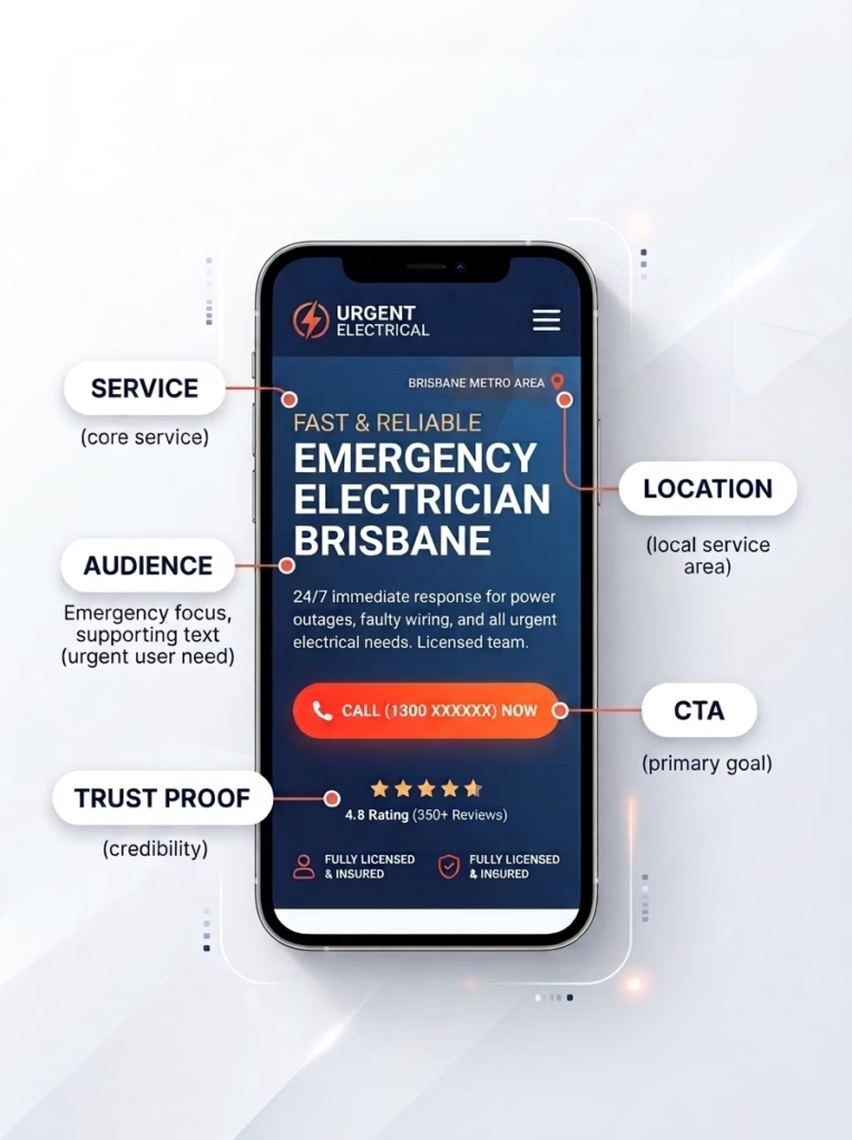
A strong homepage should answer five questions before visitors scroll: what you do, who it is for, where you operate, why they should trust you, and what action to take next.
But clarity alone does not create action. A visitor can understand what you do and still hesitate. The next leak is deeper because it deals with belief.
Lead Leak 2: Trust Is Too Far Away From the Decision
Many websites treat trust like decoration.
They put testimonials near the bottom of the page. They hide reviews on a separate page. They mention licences in small text. They assume that if the business is good, the visitor will somehow feel it.
That is not how buyer psychology works.
Trust needs to appear where doubt appears.
If the visitor is deciding whether to call, show proof near the phone number. If the visitor is reading about emergency service, show response expectations, service area, and safety credibility near that section. If the visitor is about to submit a form, place reassurance near the form: what happens next, how fast you respond, and whether the enquiry is obligation-free.
The mistake is not having no proof. The mistake is putting proof too far away from the moment where the visitor needs it.
For local service businesses, trust signals are not optional. They are conversion infrastructure. Reviews matter. Accurate business information matters. Photos matter. Service area clarity matters. Certifications, licences, response time, and real project examples matter because they help the buyer feel that the business is legitimate and safe.
Local review research also supports this trust problem. BrightLocal’s Local Consumer Review Survey 2020 reported that 87% of consumers read online reviews for local businesses, while its 2023 survey found that 87% of consumers used Google to evaluate local businesses. Google’s own Business Profile guidance also states that local ranking is influenced by relevance, distance, and prominence, and that review count and review score are factored into local search ranking. For a service provider, that means trust proof is not just “nice to have”. It can directly affect whether someone feels safe enough to call, book, or submit an enquiry.
Think of trust like lighting on a dark path. You do not put one lamp at the end and expect people to walk confidently through the dark. You place lights along the path.
Your website should do the same.
Here is the practical trust placement system:
- Put a review snippet near the hero CTA.
- Put licence or certification cues near service claims.
- Put service-area proof near local claims.
- Put process proof before the contact form.
- Put reassurance next to the form submission button.
- Put real examples near service descriptions.
- Put response expectations near urgent CTAs.
This is why “we have testimonials” is not enough. The question is: are those testimonials placed where they reduce friction?
But even trust does not solve everything. A visitor can trust you and still fail to act if the next step feels weak, vague, or mismatched to their urgency.
That is the third leak.
Lead Leak 3: The CTA Does Not Match Buyer Urgency
“Contact Us” is one of the weakest CTAs on the internet.
It is not always wrong, but it is often lazy. It asks the visitor to do emotional work. Contact you for what? A quote? An emergency? A callback? A booking? A question? How long will it take? What information do they need? Will they be pressured? Will they get a price?
The more urgent the problem, the more specific the CTA needs to be.
For an emergency electrician, “Contact Us” is too soft. The buyer may need help now. A better CTA could be:
Call Now for Emergency Help
Or:
Request an Urgent Electrical Callback
Or:
Send Photos for a Fast Quote
Each CTA creates a different psychological path.
“Call Now” fits high urgency. “Request a Quote” fits medium urgency. “See How It Works” fits research mode. “Download the Checklist” fits low readiness. A strong website does not force every visitor into one action. It gives the right action for the right level of intent.
This is the CTA ladder.
At the top, you have urgent buyers who are ready now. Give them the fastest action. In the middle, you have buyers who are interested but comparing. Give them proof, process, and quote options. At the bottom, you have buyers who are not ready yet. Give them a low-friction next step: a checklist, guide, review, or explanation.

A strong website matches the call to action to the buyer’s urgency: research, compare, or act now. One generic “Contact Us” button usually underserves visitors with different levels of readiness.
The practical system is this:
- Identify your three buyer states: urgent, comparing, researching.
- Create one CTA for each state.
- Put the urgent CTA above the fold.
- Put the comparing CTA near service explanations.
- Put the researching CTA near educational content or FAQs.
- Make the primary CTA visually obvious.
- Repeat the CTA after major trust-building sections.
If your website only has one generic “Contact Us” button, it is probably under-serving most of the audience.
But a better CTA only gets the visitor to the next door. The next question is whether that door is easy to open.
That brings us to form friction.
Lead Leak 4: The Form Asks Before It Earns
Forms are dangerous because every field feels small to the business and expensive to the visitor.
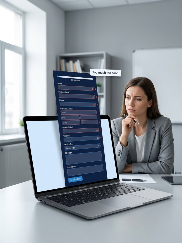
Every extra form field adds friction. If your website asks for too much before the visitor feels enough trust, the enquiry can disappear before they ever click submit.
From the business side, asking for name, email, phone, address, budget, preferred date, service type, message, and extra details feels reasonable. You want better information. You want to qualify the lead. You want to avoid back-and-forth.
From the visitor side, every field is a small decision. Every required box creates friction. Some fields also create anxiety. Phone number. Budget. Address. Exact details. If trust is not strong enough yet, the visitor starts wondering what will happen after they submit.
That does not mean short forms are always better. It means the form must match the stage of trust and urgency.
For emergency services, the form should collect what is necessary to respond quickly:
- Name
- Phone
- Suburb
- Issue type
- Urgency
- Photo upload if useful
- Short description
For a larger quote, you can ask more. For a download, ask less. For a high-trust bottom-of-funnel enquiry, deeper qualification may be fine.
The principle is: do not make the visitor pay a high information price before you have created enough trust.
Here is the form audit:
- Count the number of required fields.
- Circle any field that is not needed for the first response.
- Mark sensitive fields: phone, address, budget, timeline.
- Ask whether each sensitive field has enough surrounding reassurance.
- Add microcopy near the button: “We’ll respond within X business hours” or “No obligation quote” if true.
- Add a confirmation page or message after submission.
- Track form starts versus form completions if your tools allow it.
The goal is not to collect less information forever. The goal is to collect the right information at the right moment.
But even a perfect form can still fail if the visitor does not know what happens after submission. The moment after action is part of the conversion path too.
That is where many websites lose the lead after already earning it.
Lead Leak 5: No Follow-Up Expectation
A lead is not finished when someone clicks submit.
That is just the handoff.
If the visitor submits a form and sees a dead-end “Thank you” message, uncertainty returns. Did it work? When will someone reply? Should they call too? Will they get a quote today? What happens if it is urgent? Should they keep searching?

The lead journey does not end at “Thank you.” Visitors still need response expectations, next steps, and reassurance after they submit an enquiry.
For emergency or local service businesses, that uncertainty can cost the job. If the buyer does not know what happens next, they may contact another provider immediately. Not because they dislike you. Because they still need the problem solved.
The follow-up path should be part of the website strategy.
After submission, the visitor should see:
- Confirmation that the enquiry was received.
- Expected response time.
- What happens next.
- A phone number for urgent situations.
- Any preparation steps: photos, access, issue details, safety reminders.
- Optional email or SMS confirmation if available.
This is where the website becomes a system instead of a page.
The practical follow-up protocol:
- Create a confirmation message that explains next steps.
- Set an honest response expectation.
- For urgent services, show the phone number again.
- Send an automated email or SMS if possible.
- Route leads by urgency or service type.
- Track source, time, and close outcome.
- Review missed leads weekly.
This last step matters because conversion is not only a design problem. It is an operational problem. If the website generates enquiries but the business responds too slowly, the lead still leaks.
That is why the full audit has to include the entire path: visitor, page, CTA, form, follow-up, and booked job.
You can see the pattern now. The website is not failing in one dramatic place. It is leaking through small gaps that feel harmless individually and expensive together.
Now we need to put the whole system on one map.
Who This Audit Is For
This audit is most useful for service-based businesses that rely on enquiries, bookings, calls, or quote requests — especially local services, professional services, clinics, consultants, trades, and high-trust B2B offers.
If your website is mainly a media publication, ecommerce store, SaaS app, or community platform, the same principles still matter, but the conversion path, metrics, and CTA structure may be different.
How PixelDreams Reviews Lead Leaks
When reviewing a website for lead-generation issues, PixelDreams looks at the full enquiry path, not just the visual design. A typical review includes:
- First-screen clarity on desktop and mobile
- Strength of the main CTA
- Trust proof placement near action points
- Service page structure and local relevance
- Form length, field sensitivity, and reassurance
- Post-submit confirmation and response expectations
- Whether enquiries can be tracked back to traffic source or campaign
This helps separate “the website looks fine” from “the website is actually helping buyers take action.”
The 7-Point Lead Leak Audit
The five lead leaks above become seven practical audit checkpoints when you turn them into a website review. Some leaks are simple, like a weak CTA or a long form. Others need to be checked in more than one place, especially trust signals, proof placement, and service-page structure.
Here is the complete framework.
Point one: Above-the-Fold Clarity. Does the first screen explain what you do, where you do it, who it is for, why someone should trust you, and what they should do next?
Point two: Urgency Match. Does the CTA match the buyer’s situation? Emergency buyers need fast action. Comparing buyers need proof. Researching buyers need education.
Point three: Local Trust Signals. Do you show reviews, service areas, licences, team presence, real photos, and local relevance where they matter?
Point four: Service-Specific Pages. Do you have dedicated pages for the problems people actually search for? For an electrician, that might include emergency electrician, switchboard upgrades, safety inspections, power faults, lighting, smoke alarms, and after-hours electrical repairs.
Point five: Form Friction. Does the form ask only what is needed for the next step? Are sensitive fields justified? Is there reassurance near the submit button?
Point six: Proof Near Action. Is proof placed near CTAs, forms, and decision points? Or is it buried far below where people need it?
Point seven: Follow-Up Path. Does the visitor know what happens after they enquire? Do you confirm, respond, route, and track the lead?
This audit works because it forces you to stop judging the website like a designer and start judging it like a buyer.
A designer sees layout. A buyer feels risk. A designer sees a button. A buyer feels uncertainty. A designer sees a testimonial section. A buyer asks, “Can I believe this right now?”
That is the mental shift.
But the system only works if you apply it honestly. Many business owners will look at their own website and rationalize every weakness. The headline is fine. The form is fine. The CTA is fine. The proof is fine.
So here is the brutal test: if a stranger landed on your website while stressed, distracted, and comparing three competitors, would they still know why to choose you?
If the answer is not clearly yes, the site is leaking.
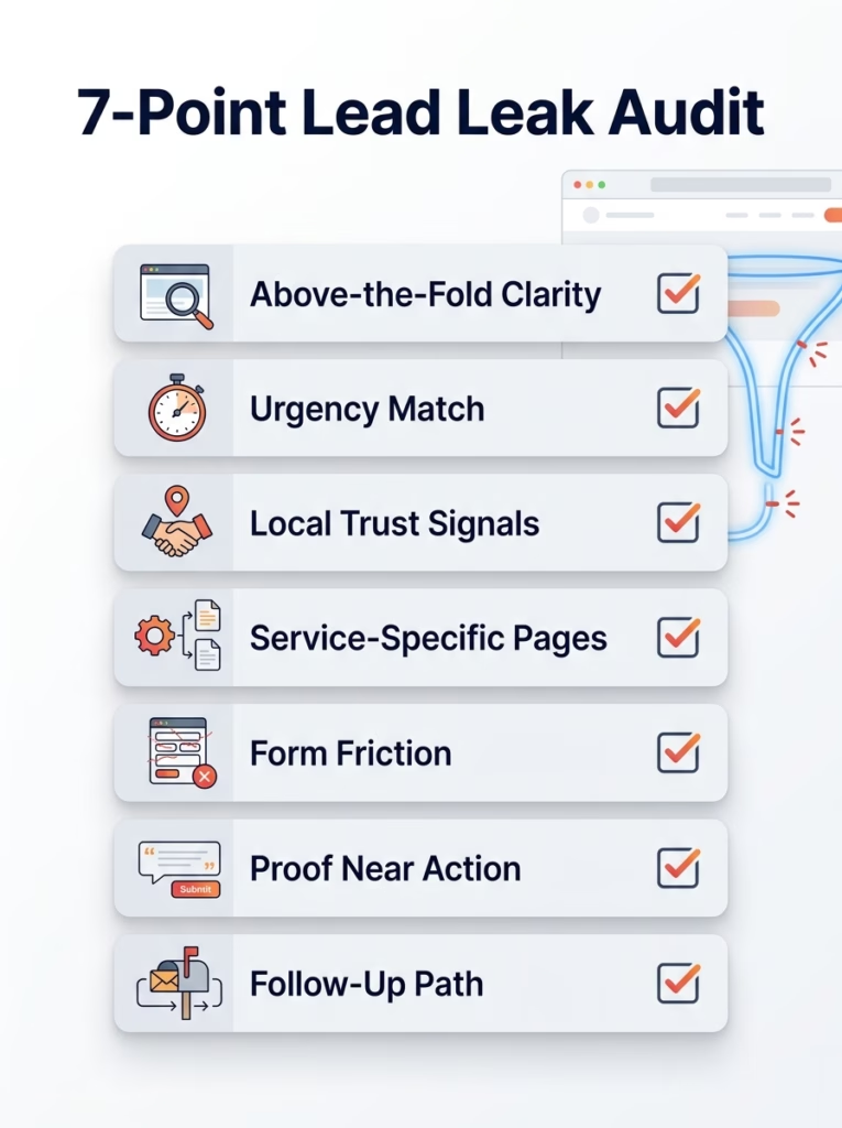
Use this 7-point audit to find where your website may be losing enquiries — from unclear messaging and weak CTAs to form friction and missing follow-up.
The Real Job of a Website
A website does not generate leads because it looks good.
It generates leads because it makes the next decision feel safe.
That is the job.

A lead-generating website does more than look good — it helps visitors feel clear, confident, and ready to take the next step.
Design still matters. Speed matters. Mobile matters. Branding matters. But they matter because they support clarity, trust, and action. When they become the whole strategy, the website becomes a nicer version of the same broken brochure.
So before you spend more money on ads, before you buy another redesign, before you blame the market, run the 7-Point Lead Leak Audit:
Above-the-fold clarity. Urgency match. Local trust signals. Service-specific pages. Form friction. Proof near action. Follow-up path.
Tomorrow morning, do this one thing: open your homepage on your phone and give yourself five seconds. If you cannot immediately answer what you do, where you do it, why someone should trust you, and what they should do next, that is the first leak to fix.
And if you want to make this easier, PixelDreams can help you run a Website Clarity Review and turn your website from something that merely looks professional into something that actively builds trust and generates better enquiries.
Because more traffic is not the first answer.
First, fix the leak.
FAQ — Website Lead Leaks
A website can look professional but still fail to generate leads if visitors do not quickly understand what you do, why they should trust you, and what step to take next. Strong design helps, but clarity, proof, CTAs, forms, and follow-up are what turn visitors into enquiries.
The most common reasons are vague above-the-fold messaging, weak or generic CTAs, trust signals placed too far from decision points, forms that ask for too much information, and no clear follow-up expectation after someone submits an enquiry.
Start with a simple Lead Leak Audit. Check your first screen for clarity, review whether your CTAs match buyer urgency, place proof near action points, reduce unnecessary form friction, and make sure visitors know what happens after they enquire.
No. More traffic does not fix a leaking website. If your website is unclear, low-trust, or hard to act on, more traffic only sends more visitors through the same leaks. Fix the conversion path first, then invest in more traffic.
Ready to Find Where Your Website Is Leaking Leads?
If your website looks professional but still does not generate enough enquiries, PixelDreams can help you review the clarity, trust signals, CTA path, forms, and follow-up experience behind the page.
We will help you identify what is making visitors hesitate — and what needs to change so your website feels clearer, safer, and easier to act on.